Beautiful Big Background Image Website Designs with Video Background
We stumbled on this site and found it creative, quirky and interesting in the way the sites that make full use of video backgrounds and videos. We hope you find our showcase useful for your next web design project.
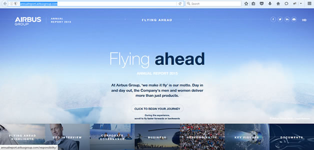
Airbus Group the largest aerospace and defence company in Europe. Its investor relations website has taken a unique approach to creating its branding. An interactive background video filmed with a retro flying ahead and above the clouds tells the story of their company set in a flying journey using the mouse scroller to control the speed and backward cum forward directions.
Videography
Web design sure does look extraordinary these days. With the rise of HTML5 it's become easier to add things like animation and video to create a richer user experience. These visual flourishes can often work to create a more interesting, immersive and remarkable experience if done properly.
Website : Airbus
Web Server : Apache

Maybe because Airbus has achieved all its performance objectives easily in 2015, there's just a good vibe going around in the way the investor relations data are being displayed, structured, presented, and of course designed. The trends in website design this article are reflective of that positive feeling, with cool videography as background, big photography and cool color choices.
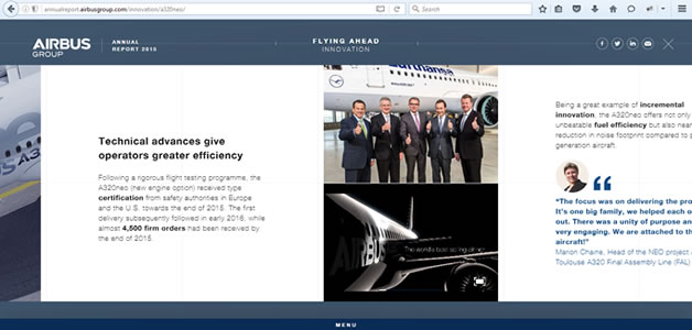
In general, Airbus web design moved away from designing standalone pages towards designing flexible and sophisticated design systems. The designer's focus on the components first, and then combine them to build larger components that eventually make up a page. It's easier to comprehend the complexity of multi-screen experiences this way. But even then, we tend to see responsive design merely as a collection of slightly differently sized rectangles, with a slightly different layout, sometimes with slightly different content poured into them. I love the videos being used in certain parts of the component, but one setback is on responsive web design when viewing the video on the smartphone or tablets, there is no left right scrolling hence cutting the video into half visibility.
When it comes to fostering interaction or conveying a message, nothing beats videos! Airbus web site embeded with plenty of videos and they expect users to click and watch it hence they thought about user experience and the speed of the video being played with least latency, they chose Akamai as the CDN provider.
Airbus Web design does the story telling very well and conveying the right message. The navigation throughout the web site is easy and user friendly, mainly by just scrolling the mouse will do wonders.

Airbus web design leaves no stone unturned in its bid to connect and interact with its users. Although it uses multiple one page parallax design, it also encompasses responsive auto show/hide toggle menu with jQuery, and implemented the fade-in effect in a nice way to fade the pages in using CSS and a bit of JavaScript. The solution is clean and smooth, with no flickering on load.
More and more video content is being generated every day, and modern internet users often tend to prefer videos and images over plain text. As such, incorporating a video background in your web design can actually go a long way to bringing your design to life. In fact, the onus and willingness to interact and send out a message is what separates great web design from good ones. On the whole, this site is using large background videos to subtly change the mood and atmosphere, by demonstrating their product in action and using it to tell a story that wouldn't have been as easy or perhaps as fun as with a regular, static page.
Larger than life photography

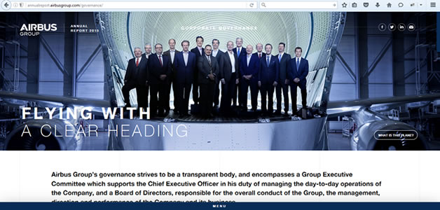
A big, bold photograph or image makes a stunning first impression. That's why so many designers are selecting larger-then life images to draw users into their website designs. This design element can be surprising, interesting and be a great alternative if you have one or two great images, but not a large library to work with.
Using the right kind of imagery can compel your visitors to move along the page, click a CTA, or even share it with friends - and sometimes pictures are just nice to look at. In the end, images say what words can't, and when considering your site's design, using relevant photographs is a great option to convey emotion, feeling, and a general sentiment without relying on content or design to solely carry the job.


